


« Back to February 2014 Competition
New Office
by Karthik Arun
A New Office.
Comments
(Commenting only available during the rating period)
Vardan Galstyan
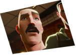
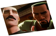
The first personage is ok, but the second one is overacting and the view is cut!
Mervyn Le MandarinOrange
Animation can be more fluid..
April Slocombe
A couple of choppy movements and excessive head movements on Bill but the rest of the animation is good.
Harun Aydin
Too much unnecessary head bang at the and. Rest is good.
kishan Rathod
Ok !!
Satya
The adequatulance part of it has too much of head movement.. otherwise really nice
Shelby Christie
The gesture at the end is a little over done in my opinion. It makes the dude looks a little crazy. Unless that's what you were going for, I would definitely tone it down some.
Great job otherwise though! I like the layouts.
Christof
The doorway pose was really unique and had a lot of life. Watch the speed of character movement.
Spencer Barber
I really like the first half. The second half (starting with "virtually") doesn't feel natural at all.
Lee
The guy in the doorway looks great but the guy with spikey hair is a little too fast
[user]
I think you really nailed the first character, but the second needs more attention