

« Back to July 2014 Competition
CHANGE!!!
by ZeeZa Rode
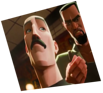
Story of a vampire who wants to change everyone. To create a vampire army!
Comments
(Commenting only available during the rating period)
Erik Dfocus
Great first pose,and animation!
Anthony Travieso
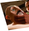
Best vampire one I've seen. I would use the female version of this rig. For the guy that comes through the door. For me the first line sounds like a woman. His cartoony scrabble after he opens the door feels a bit floaty, And the nose stuff at the end isn't working to much.
Anneke de Graaf
Looks really good! Loved the position of the 'dead' character in the beginning. I also liked the fluent motion of the vampire in contrast with the guy. The lip-sync is a bit off and something funny happens to the nose of the guy in the end. And if I may suggest; in stead of the leg of the chair next to the dead guy, you can put the leg of the vampire there. It ties the story a bit more together.
Daniel Vasconcellos
Good animation, i loved the guy reaction when he opens the door!
Robert Firestone
Love the opening pose.
Srinivasan S
Lip sync is bit off ... But rest is really cool :)
Jocelyn Gray
Fun!! Great animation, congrats!
Amartya Mukherji
wow.. this one is the best so far. Not only the rendering but the animation is also smooth as silk. Great work.
Natalie Wilkinson
Loved this one. Such attention to detail, down to the nose twang at the end. :)
Moy Parra
the shot and characters have nice flow. Lip sync can be tightened quite a bit particularly with the first character. Your timings could be a bit quicker too so that the characters feel less floaty.
RAHUL SHARMA
overall looks nice..................but some points its need some improvement..... like malcom shocking animation....his point finger animation..then when the dracula come to him dracula's back hand got stuck
JnoS
Awesome !!!
RobertCollier
less time rendering and more time animating some of those acting choices could be better. this is not a competition about rendering.
Ki young Hwang
timing...
Richard Clark
This was really well done. The only thing that catches my eye every time is when the red shirt guy lifts his arm on "you killed him" It's too fast. Looks like it pops and hits a wall. And the dead guys pose looks a little strange but that's probably because of the limitation of the rig.
Ryan D Lowe
The finger point on F156 is not really helping this one. Great work otherwise! Watch those twins on F170. Move that nose more on the face, and tighten the fingers at the back end so theirs some keep alive in them. I think Malcolm's take is too much. Either speed it up much faster, or cut it altogether. Love the head accent on "LIFE". Good stuff.
Onkar Singh
wow!! what a entry. i love that.